For many, 2022 was another year of uncertainty.
It was also a year of connection and reconnecting. Some teams migrated back to the office, back to late-night whiteboard sessions and well-deserved team happy hours. And many others continued to learn creative new ways to work together, even while apart.
Despite pressure from all sides, the Airtable community built apps that continue to connect global teams. And as the Airtable community scaled and evolved, our platform did too.
Record limits were expanded, and we created a new admin panel. Then there was two-way sync, the general availability of Interface Designer, improvements to automations, and a robust new permissioning system.
Here’s a look back at everything you brought to Airtable in 2022, and some of the landmark changes to our platform.
How were our customers using Airtable to stay connected in 2022? Like this.
Connecting data across your teams

Throughout the year, we launched new ways to connect data so that everyone at your org has access to the same, up-to-date information.
With new integrations, you have even more opportunities to sync Airtable with your other favorite apps. Our integration with Miro, for instance, lets you transform your team’s whiteboard brainstorms directly into records you can assign and act on. Other syncs include Tableau, Adobe Experience Manager, and an emailed data sync.
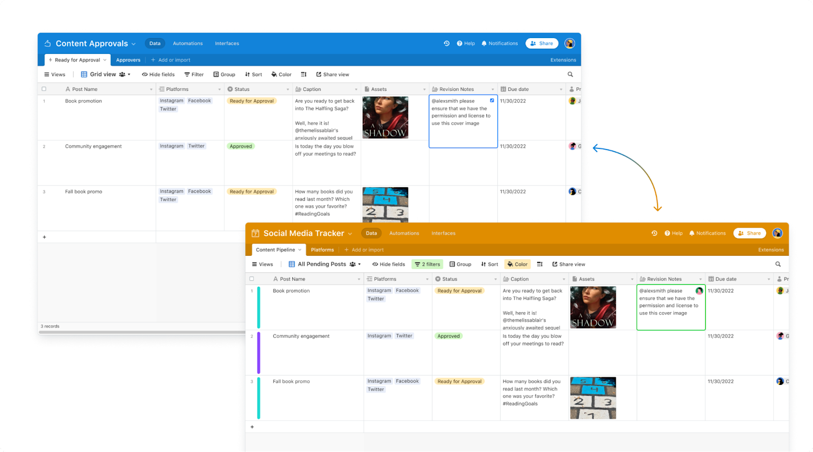
We’re also rolling out two-way sync (in limited availability for Enterprise customers) so any updates in one synced base can automatically update the other–no need to worry whether the info in your base has grown stale.
By connecting your data, you connect your people–and that means you can get your best work done, together.
Building even more powerful apps
We loved seeing teams’ creativity come to life through the custom apps they built. To continue empowering your wildest productivity ambitions, in 2022 we made it easier to build in Airtable.
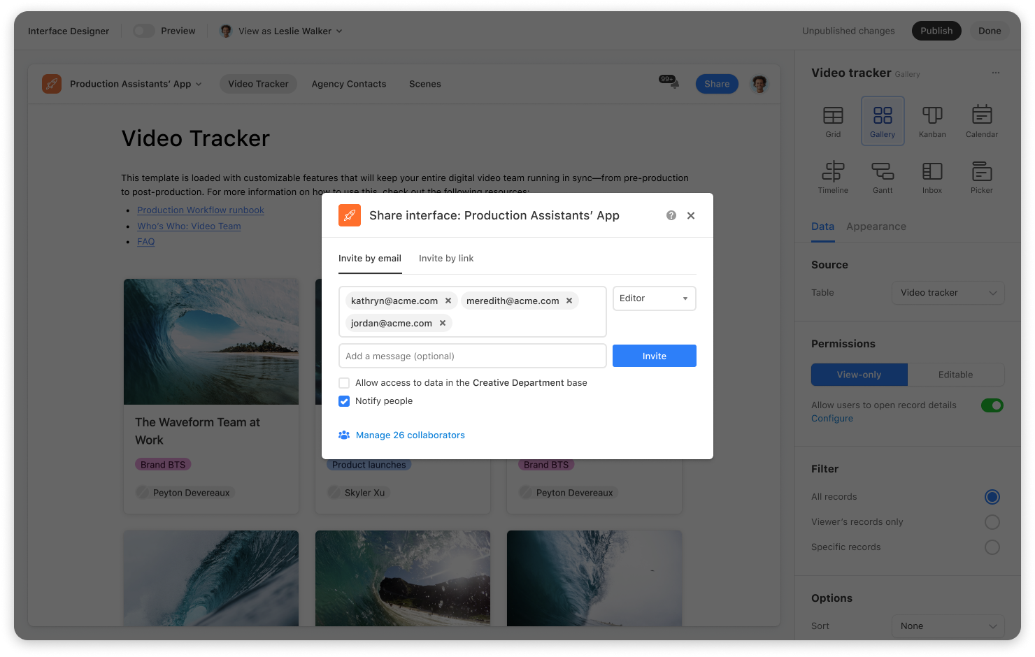
In October, we added a ton of new capabilities to Interface Designer–and made it available to all users so that anyone can create interactive interfaces using their data. Build the interface of your dreams quicker than before with custom detail pages and an improved publishing experience. A redesigned navigation bar and new buttons simplify work for collaborators.
Automations also got some love. From a brand-new automation that exports and formats records into a Google doc to improvements that make automation testing more precise, and a way to automate your most complex workflows with conditional logic, it’s easier than ever to put manual work on autopilot.
And thanks to your feedback, we made tweaks to ensure working with complex data in your base is actually quite simple. That included a new “add more” button, for instance, which lets teams add all kinds of features to a base from one central place, as well as a “group” button that gives you suggestions for possible fields to group by.
Scaling confidently and securely

Finally, we released tools to help orgs maintain security and manage workflows, even as they added new employees by the dozens.
Our granular Interface Designer permissions let teams share interfaces—without giving full access to the underlying data in the base. With user-based filtering, teams on Pro and Enterprise plans can also customize the specific data each user will see when they access an interface, allowing teams to make apps that are as secure as they are shareable.
And to help organizations scale, we increased record limits for Enterprise accounts, introduced a new field manager so creators can make bulk changes to their base, and gave admins the ability to restrict certain attachment types that pose security risks. With these tools, creators and admins alike can keep their work running smoothly and safely, even if their orgs double (or triple) in size.
We can’t wait to keep building with you in ‘23.