You could say Andy Warr kicked off his design thinking early. He was the kid who was always building Lego sets, and later taught himself computer programming on a Spectrum 128K (Britain’s first hit personal computer, released in 1982).

Today he leads a research team of 13 at Airtable, after running UX and research teams at Uber, Instagram, and Google.
Airtable is famously user-friendly. When CEO Howie Liu launched the company with cofounders Andrew Ofstad and Emmett Nicholas in 2013, they spent months obsessing over things like window opening speed and the platform’s interplay of colors. Reviewers and commenters now note that Airtable is “super easy to use” and has “simple language, friendly color schemes, and helpful icons.”
So how does all this focus on user-friendliness play out for the UX team?
Warr walked us through how UX is changing as a discipline; how Airtable does UX differently; and other currents he’s thinking about as Airtable gears up for an ambitious year.
Q: How does UX at Airtable differ from UX at other companies?
A: Our focus on deep design lets us take customer feedback not verbatim—but instead in a way that helps us deeply understand customer problems, needs, and perceptions. Our team then tries to solve for those problems elegantly.
Another thing that makes Airtable research truly unique is that we are more than just UX. We’re looking at market and quantitative research. We focus on the bigger picture.
Q: How do you zero in on customer problems?
A: When we start a project, anywhere on the product team, our questions are: What is the customer problem? What are their needs? Are we actually solving the customer problem?
Based on the understanding of the customer problem, we then determine what success will look like. We identify the metric we will obsess over, as well as observation or guiderail metrics that ensure we consider the bigger picture.
Q: How are Airtable users different from other user groups you’ve worked with?
A: There are a lot of different segments of users within Airtable, and we do a lot of research to try and understand who they are.
First, the creators—these are people who create applications in Airtable. Second, the collaborators—the people who use those applications. Within these segments, there are individual contributors, managers, and executives, as well as admins who oversee the entire experience. A further step is to consider which plan a customer group is using, and the size of their company.
At its core, Airtable is a database. But the majority of our users don’t have database experience. They have spreadsheet experience. We can’t assume everyone understands what a database is and how it works. We have to lower the floor and gradually introduce people to the high-ceiling capabilities Airtable offers.
Q: Do you spend more time thinking about Airtable users’ feelings than you might at another company?
A: Yes. In addition to running qualitative research, we run customer satisfaction (CSAT) and Net Promoter Scores (NPS) surveys, as well as ad-hoc surveys to understand specific experiences, such as awareness and perceptions of pricing, to name a few examples. This lets us measure the pulse of our customers. Just because someone’s using your product doesn’t mean they’re happy using your product.
Our team uses these results every day. Our execs, board, and investors check on these results too, surprisingly frequently compared to other places I have worked. Not all executives care this much about how customers are feeling. It’s another signal of how customer-obsessed we are.
Q: How has the pandemic affected your work?
A: If you look at a UX researcher’s work before the pandemic, they might be flying to a location to visit users, or observing from the back of a room in a lab.
Now, they’re switching to doing that type of observation in a 1:1 Zoom meeting, or in a large virtual group. This changes the research in a lot of ways, plenty of them good.
First, it diversifies research groups. We might now easily speak to users in India or France, as opposed to just a group of people near our office in San Francisco.
True, it may reduce the richness of the research in some ways, not being able to absorb the complexity or dynamics of someone’s workplace and team. But we also might get different and better answers when people talk about their experience. And we can conduct research in more scalable ways.
How Airtable uses Airtable to do UX research
1. Product planning
During the product planning process at Airtable, the UX team works with other teams to identify the research studies they want to carry out in a given quarter.

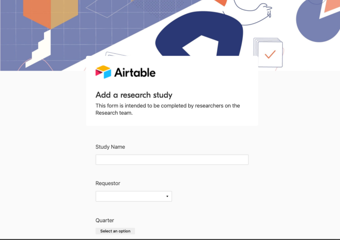
2. Adding research with an Airtable form
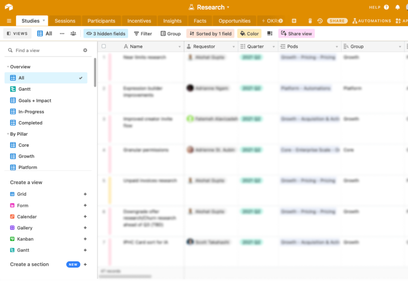
UX researchers add their planned studies to an Airtable base using a form. The studies in the base are organized into sections and views, which lets the team filter them by pillar, researcher, or quarter.

3. Creating a research roadmap
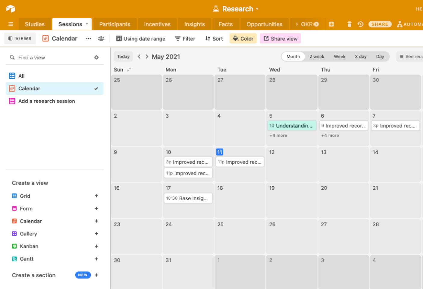
The team then maps out and visualizes its research studies for the year, using a start date and end date. They might show Airtable’s leadership team a calendar view or Gantt chart of the year of planned studies. Or they can share these views with other Airtable teams to give an overview of UX projects for the year.

Learn more about UX at Airtable
Read up on how to create a collaborative UX workflow for research. Or, get started building your own UX research database with our video tutorial. And check out our complete set of Product, Design, and UX templates.