If you’ve used Airtable’s Interface Designer, you know it’s a game changer for collaborating with others.
That’s because Interface Designer allows you to create interfaces that cater to your specific audience’s needs, ensuring they see the information that matters to them, in a way that makes sense for their workflows.
And today we’re introducing a few important updates to Interface Designer that give creators even more ways to build interactive experiences for their teams.
Quickly visualize assets with the gallery element
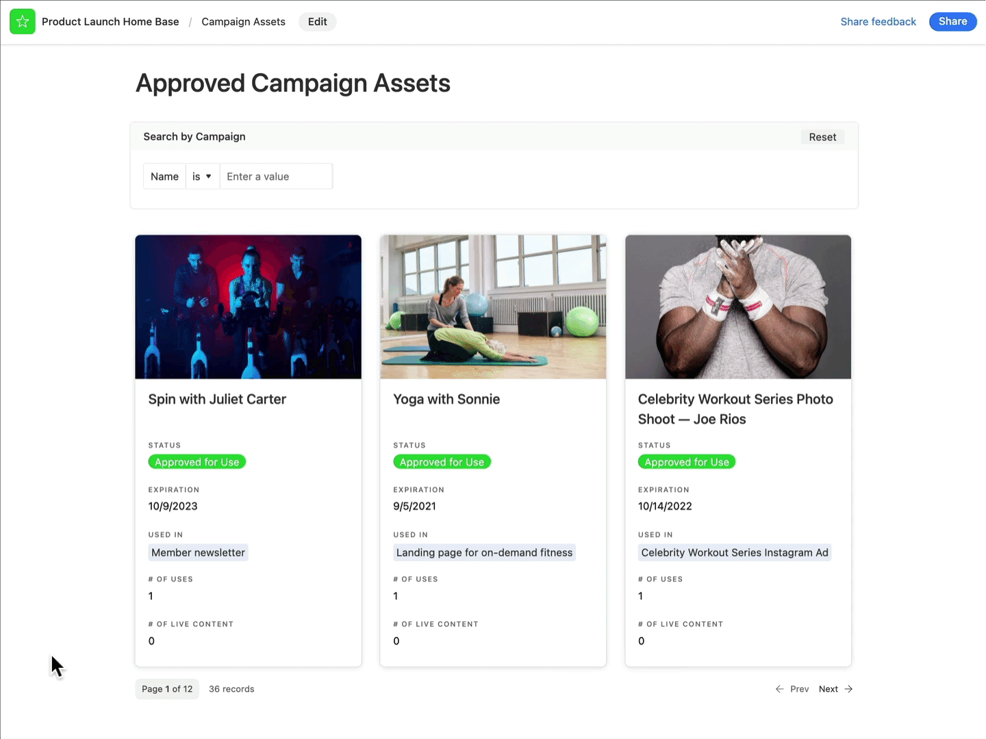
First up is our new gallery element, which allows teammates to view multiple images, resources, or other key info side-by-side for easy viewing. You can drop the gallery element into any interface, which will then display thumbnails of your desired data.
Because the gallery element makes sorting visually simple, the use cases are endless. We believe the gallery element will quickly become a crowd favorite for managing assets for a product launch and creating a home for internal resources, like sales materials or a team directory filtered by organization or team.
Easily organize large data sets with record review grouping
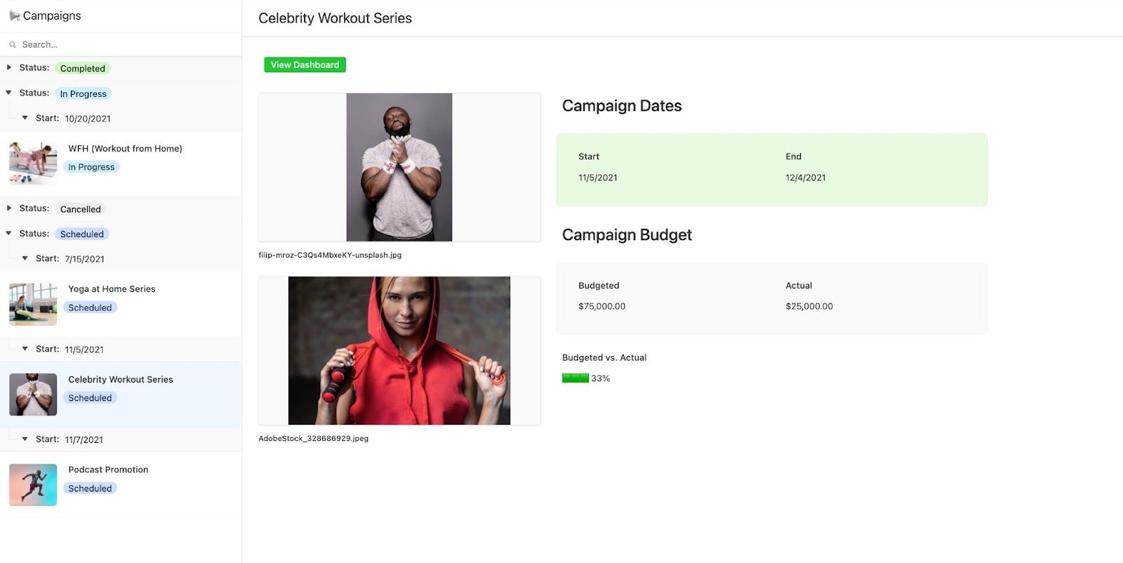
Interfaces pare down your information and display only what’s most relevant to collaborators, but what if you’re still working with large sets of data, like assets for multiple campaigns?
You can now group and collapse sets of data in the record review layout–the perfect solution for users who need more filtering options. Try grouping your information by status, team, or location so that collaborators can quickly find what they’re looking for. To get started, find the “group” option in the drop-down menu, below “filter” and “sort.”
With up to three layers of grouping and an option to color-code groups, you can easily categorize data sets and make your interface even easier for your team to navigate so they can find and take action on the information most important to them. 👍
Make meaningful comparisons with new chart capabilities
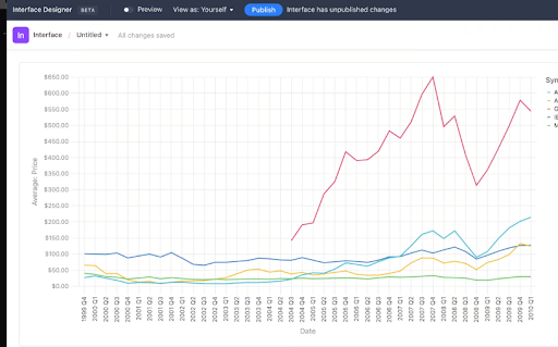
The chart element is a fantastic way to display an intuitive snapshot of information, whether it’s in bar, line, scatter, pie, or donut format. And we’ve added even more ways to visualize your data at a glance with this element.
Now, you can add multiple lines of data onto a line chart, allowing users to quickly compare and analyze information. Say hello to monthly budget comparisons and projected vs. actual revenue reports. We also added a percentage value to pie and donut charts so users can understand their data faster.
Learn more about the visual elements you can add to an interface
We think these new features will help make Interface Designer more useful and easy to use. And this is just the start. We’ll continue launching new features and improvements in Interface Designer throughout the year, and we can’t wait to see how you’ll use ‘em.
You can use these new Interface Designer features in Airtable here.
Learn more about how you can create an interface right from your base, and check out our Interface Elementals blog series for tips on molding your interface with elements.