Welcome to Interface Elementals, a series covering the unique types of elements that can bring your interface to life, your way—whether you’re designing for team members or executives. Interface Designer offers a variety of dynamic elements; here, we break them down and give you tips on when to use each.
Airtable’s Interface Designer lets users share information through visually appealing, easy-to-navigate interfaces—a feat made possible with drag-and-drop elements.
There are a dazzling array of elements to meet your interface needs, including the ability to display your information more vibrantly. Here are four visual elements you can use—grid, number, timeline, and chart—as well as best practices to incorporate them into your own interface.
Keep info on-hand with the grid element
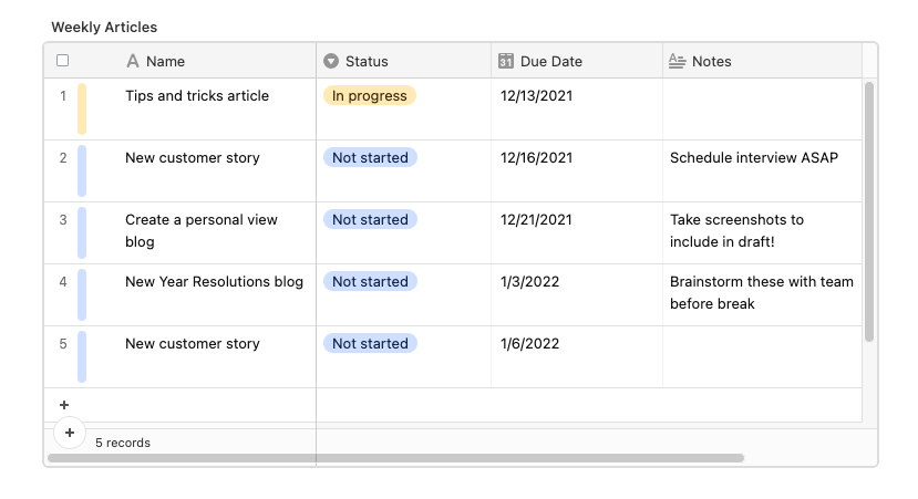
The grid element lets you add a table straight from your base into your interface, displaying your records in a grid. You can also dictate how the records are presented by copying from an existing view.
And this element is customizable, so you can adjust the grid’s row height, group, field visibility, and color according to your needs. Add a label at the top of the grid so your audience immediately knows what they’re looking at.
⚡ Pro tip: keep your grid easy on the eyes by only showing the data most relevant to your interface. Utilize those filters!
When should I use the grid element in Interface Designer?
The grid element is essentially a list of information, so it’s perfect for anyone who wants to scroll through multiple records at a time. It’s also user-editable, making it easy for collaborators to sort through the data themselves. For example, you can incorporate the grid element into a design request interface so your designers can view upcoming assignments.
Sum it all up with the number element
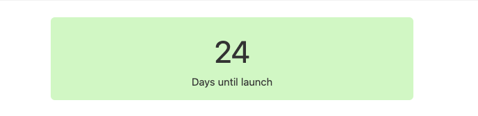
Why summarize your goals or values in words when one big number can do the trick? This element shows a number that reflects a record count or field summary, meaning you can choose whether you want it to sum up your total deals, remind you of an upcoming deadline, and more.
After connecting the number to a record set or field, don’t forget to customize the text below the number and choose a color to make it easily understandable.
When should I use the number element in Interface Designer?
The number element is so straightforward that it’d sit pretty in just about any interface—we recommend using it when you need to highlight high-level metrics for leadership or stakeholders. Create a launch countdown for your product roadmap interface so team members don’t lose sight of the end goal, or display the number of assets that still need approval in a content review interface.
Track deadlines with the timeline element
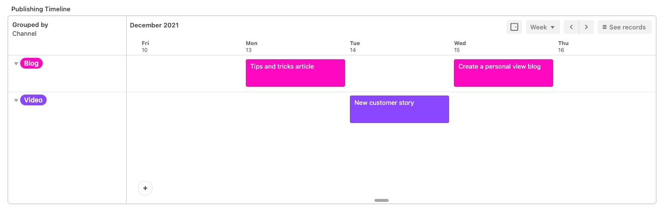
Like Airtable’s Timeline view, the timeline element displays linked records along a horizontal line, so you can visualize your tasks or project phases over time (days, weeks, months, etc.) After connecting the element to the relevant table, you can group your records by a designated field, like project owner. You’ll also need to set date fields, so make sure you have a start date (end date is optional).
When should I use the timeline element in Interface Designer?
The timeline element is a no-brainer for deadline-oriented interfaces. Think content approval interfaces for marketing teams that need to publish content on specific days, in different channels. It’s also ideal for tracking goal progress in product roadmap interfaces.
Provide a snapshot with the chart element
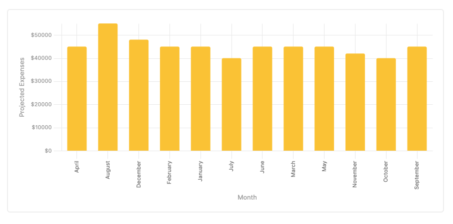
Sound familiar? The chart element functions just like everyone’s favorite chart app: it displays your linked record data in a chart of your choosing (bar, line, scatter, pie, or donut).
When you pick a chart, you’ll have to configure the x- and y-axis using existing fields from your table. We find that users typically choose date and number fields for their charts. Then, add colors and labels to make your chart even more comprehensive.
⚡ Pro tip: if you used colors in your connected table, you can transfer those same colors over to your chart. Pretty nifty, right?
When should I use the chart element in Interface Designer?
Add this element to your interface if your audience would benefit from a big-picture overview of a table. Because of its ability to summarize records in a simple and visually appealing way, it’s great for leadership-facing interfaces—one example is a revenue projections interface designed for an executive team.
Put these visual elements to work—learn more about how you can create an interface for stakeholders, leadership, or just yourself here.