Today, we introduce our new iPad app. It’s only been a few weeks since we launched our redesigned iPhone application (check it out! but this is something different: an entirely new way of organizing and interacting with the information that matters most to you.
One of our goals with Airtable is to put the database to work for absolutely everyone — regardless of their technical background. On desktop, that means capturing the flexibility and simplicity of the spreadsheet while also delivering the power of real database structure, empowering absolutely anyone to organize things the way they want.
But there are some things the iPad just does better than the desktop. It has the portability of the iPhone but the power of the desktop. You can multitask without sacrificing the intimacy and intuitiveness of the touch interface. It’s free from distraction and encourages focus. It makes browsing content feel magical.
And, of course, you can create content on iPad, too. But sometimes, what you need is a blank canvas for structured data. Like a spreadsheet, but better — designed from the ground up for a touch screen, and with an organizational, rather than number-crunching, mentality.
Enter the Airtable iPad app.
As flexible as a spreadsheet. Built for the iPad.
Much like the iPhone app, the iPad app database displays records as a series of cards (much more tap-friendly than narrow spreadsheet gridlines stretching to infinity). But additional screen real estate means we can take it even farther, by allowing you to expand, read, and edit records while still preserving the context of the list.
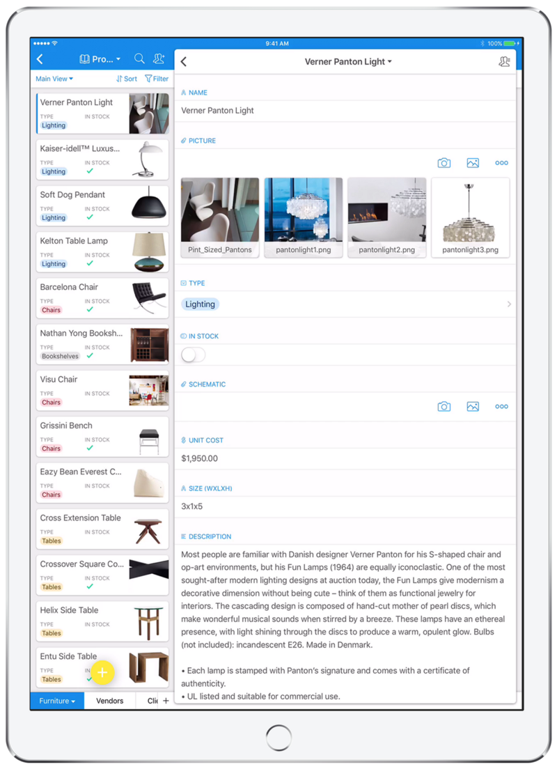
We designed the iPad app to fluidly adapt to any iPad size variant (from the mini to the Pro), and any permutation of split screen modes — landscape + portrait slide over, landscape + portrait 50/50 split view, landscape 40/60 and 60/40 split view, etc.
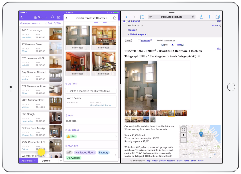
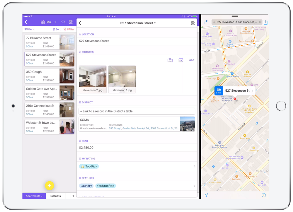
For instance, if you’re searching for a new apartment, you can keep each listing in view while capturing the most pertinent details to inform your search. Because the full record list is still visible, you can quickly compare crucial details like rent and location to other apartments already under consideration.
Turning Data into Action
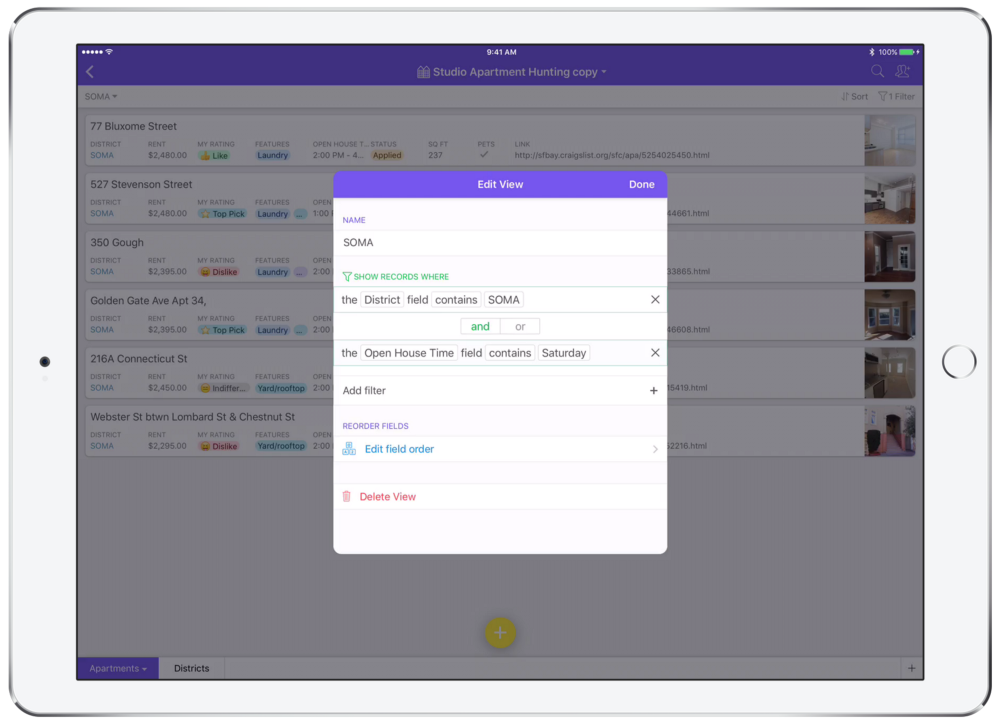
Once you’ve narrowed your list down, you can filter by district and open house hours to identify all listings you could visit in a single trip.
From there, you can simply slide open Maps to grab directions to the first listing and you’ll be on your way!
Now, whether you’re planning your volunteering schedule, following up with a client about their furniture order, or even trying to choose screenshots for a blog post, you can keep every detail you need to get things done right at your fingertips.
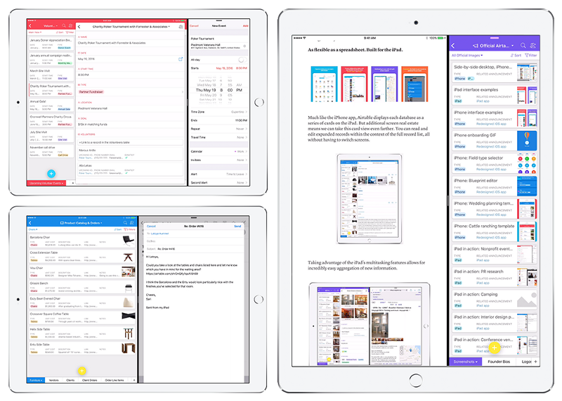
Multitasking in action.
But don’t take our word for it… try it out for yourself! With dozens of templates to get you started, ranging from planning out a novel-writing project, to organizing cattle and farm equipment, we’re sure you’ll find a great use case (or a hundred) for the Airtable iPad app. Good news for you — it’s now available in the App Store!
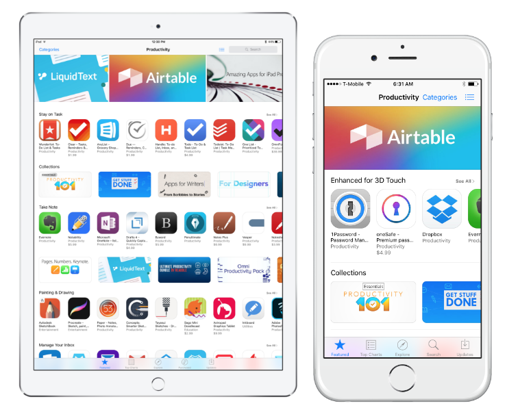
Update: Airtable is officially a featured productivity app in the App Store for both iPhone and iPad!
