Balancing resources can be a doozy. To get your products and initiatives across the finish line on time, you need a strong grasp of your resources, whether you’re juggling workloads, budgets, or something else entirely.
Having a deep understanding of each team member’s weekly availability, for example, can help you set realistic deadlines and assign tasks to the right people.
You might already use Timeline view to keep tabs on tasks and projects over days, weeks, and months. And now it’s also ideal for tracking your resources, with new grouping abilities and summary bar functions–perfect for helping you to drive a campaign or develop a comprehensive product roadmap.
Plan ahead & determine resourcing needs
The best way to avoid over-allocation issues is to never experience them in the first place. Thinking through project durations, budgets, and team member capacity before you start a campaign can ensure you accomplish your goals on schedule.
Plan ahead with the summary bar, which automatically makes calculations based on record values. These summaries can help teams uncover resource-related data (like the average time spent on projects every week).
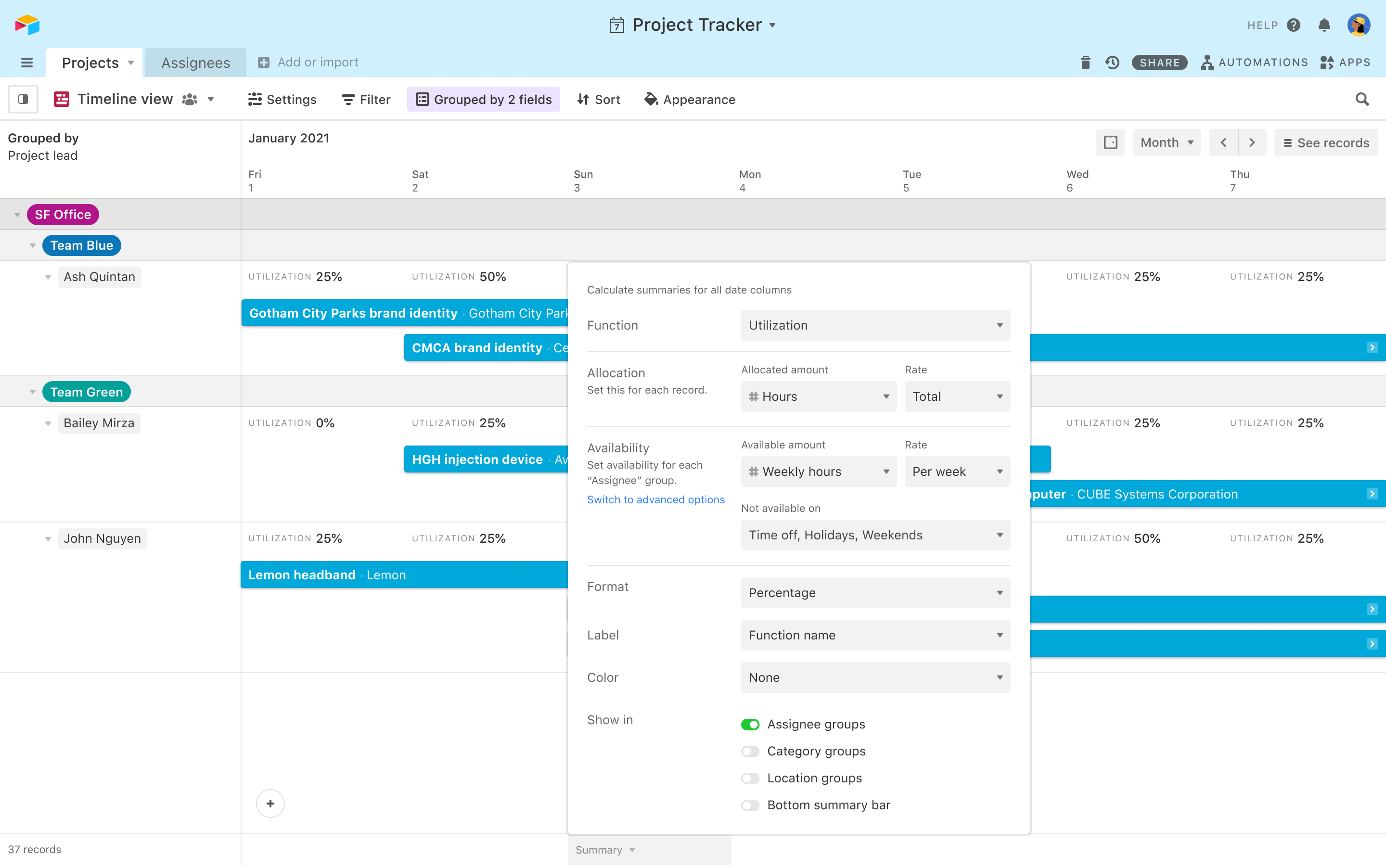
When you pull up the summary bar in a Timeline view, you’ll get to choose from a wide range of functions to calculate summaries, including:
- Count
- Sum
- Average
- Min
- Max
- Range
- Median
- Utilization
The summary bar’s utilization function is particularly helpful for calculating exactly how much of a team member’s capacity is being used (or underused) by generating utilization percentages.
So if you’re planning a big debugging effort, you can determine which engineers to assign with a simple percentage (If Greg is at 75% utilization because he’s on two other projects, you might want to consider someone else). Or, you can factor PTO into utilization to make sure your team members take some well-deserved time off.
And if everyone’s utilization percentages are high? You can add hiring external support to your plan.
Learn more about the summary bar and configuring the utilization function
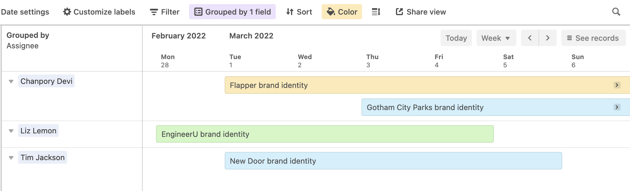
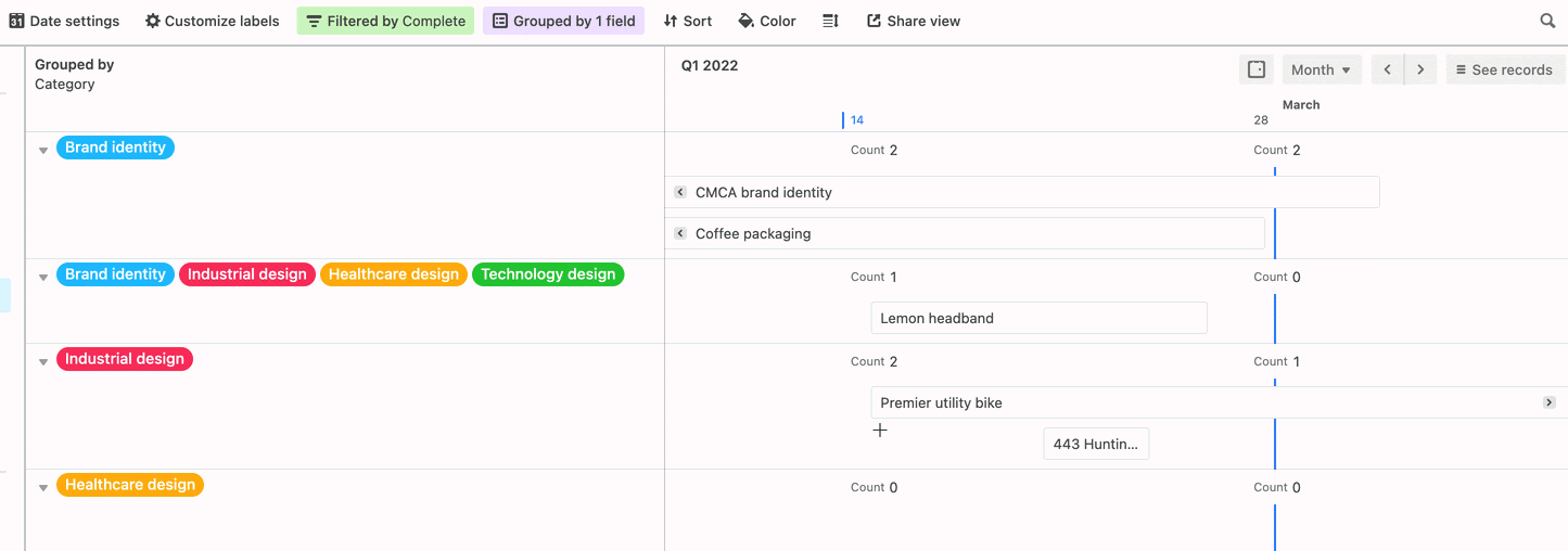
You can also make resource allocation easier to understand with grouping. Grouping lets you make quick and distinct associations between multiple records, and can help you visualize how projects are being resourced.
So to ensure you hit each and every OKR this year, you can group your records by OKR to easily see which objectives have more, lengthier projects, requiring additional resources like time and manpower. From there, you can determine the number of people to assign to each project.
Quickly find balance when resources are over (or under) capacity
Whether you’re a PMM running a new feature launch or an engineering manager creating the actual feature, it’s critical that you can balance resources quickly to stay on track.
And now there are some handy ways to maintain this balance in a Timeline view: through conditional coloring and the ability to drag and drop records.
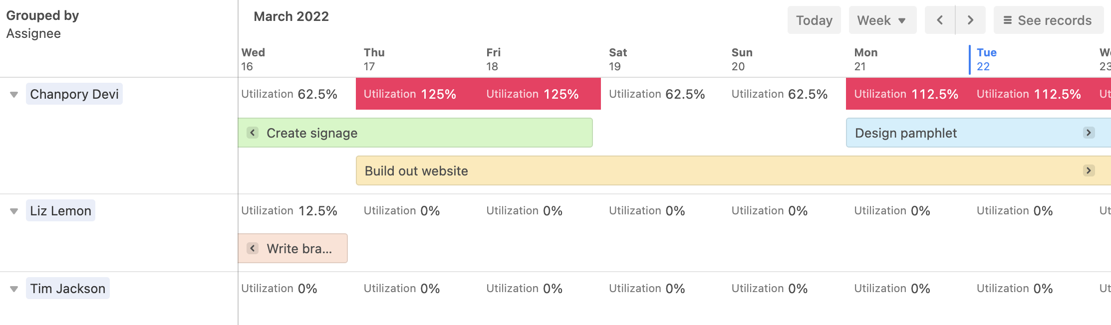
In addition to summary functions, you can also add color to the summary bar based on certain conditions.
Say you have a designer who’s notorious for always saying yes to requests—but you notice their utilization percent is growing steadily. You can automatically recolor the summary bar in an eye-catching red when utilization has hit 100%. Or, you can turn records yellow when that utilization reaches your custom-defined “danger zone” (like 75%).
So the next time one of your designers has taken on too many assignments, you can see it at a glance (and make major changes before it becomes a major problem).
And when you have a team member with too much on their plate? Thanks to Timeline view’s new drag-and-drop function, you can simply move projects. With a click and a drag, you can move records into different groupings directly on a timeline. Take a project from an overworked colleague and drop it onto an available team member’s timeline–crisis averted. 👍
Learn more about grouping records in Timeline view
With these latest additions to Timeline view, you can plan your resource distribution and catch over-allocation issues early–giving you complete control of your deadlines and ensuring you hit every one of your deliverables.
Airtable’s Timeline view is currently available for Pro and Enterprise users.
Create a Timeline view in your base now to start managing your resources.