If Jenny Bodenlos knows one thing about the way companies operate, it’s that—despite everyone’s best-laid plans—somewhere between strategy and execution, things can fall apart.
Bodenlos should know. She’s something of an operations and project management whiz, beginning her career at a Big Four accounting firm, then spending 17 years in strategy and operations at a Fortune 500 retailer. Now she's landed at fast-growing martech startup BlueOcean.
Six years ago, she stumbled across what she calls the ‘red thread’ problem—meaning individual team members didn’t understand the connective thread that tied their daily work to a company’s larger goals. (Hear more about the ‘red thread’ problem in Bodenlos’ LinkedIn Live session with Airtable.)
Finding ties that bind strategy to tasks
So how does Bodenlos tackle this problem in her daily work as Head of Enterprise PMO (project management office) at BlueOcean?
It all comes down to three essential interfaces in Airtable: a weekly status chart, a granular project tracker, and a tool for sprint planning. To be sure, because Bodenlos is monitoring project management across the company, she relies on a wide variety of additional views and apps to help her follow the red thread. Those include a calendar view with color-coded activities and an org chart app, which helps her visualize the way that OKRs connect to projects and tasks.
But the three views below, all interactive interfaces, are critical to giving every employee at Blue Ocean visibility into how their projects fit into the company’s big-picture efforts.
Interface 1: Weekly “Red Yellow Green” Status
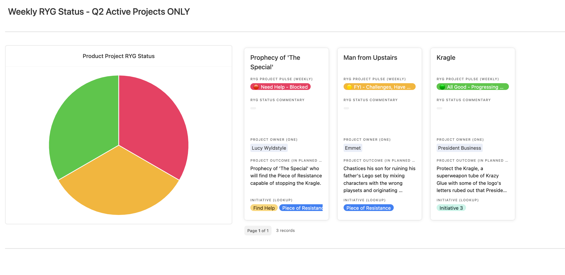
This view gives Blue Ocean’s leadership teams an instant, intuitive look at weekly progress on any project. For the uninitiated, “red yellow green” labeling works just like traffic signals: green means the project status is “all good,” yellow indicates it may be at risk, and red signals that the project is way off course.
Jenny built the elements in this interface from one table in a main project management base, which includes granular data on all active company projects. Project leads give updates as red, yellow, or green. Then the pie chart gives leadership a real-time pulse of what’s happening with every project, along with its blockers.
A company leader might see that a project is stalled because it lacks approvals—and therefore step in immediately to assist. Executives can click into the records at right to see notes and comments from team members. “They don’t have to wait for a 1:1 meeting or even a quarterly review,” Bodenlos says. “It’s a curated story.”
Interface 2: Project Cards
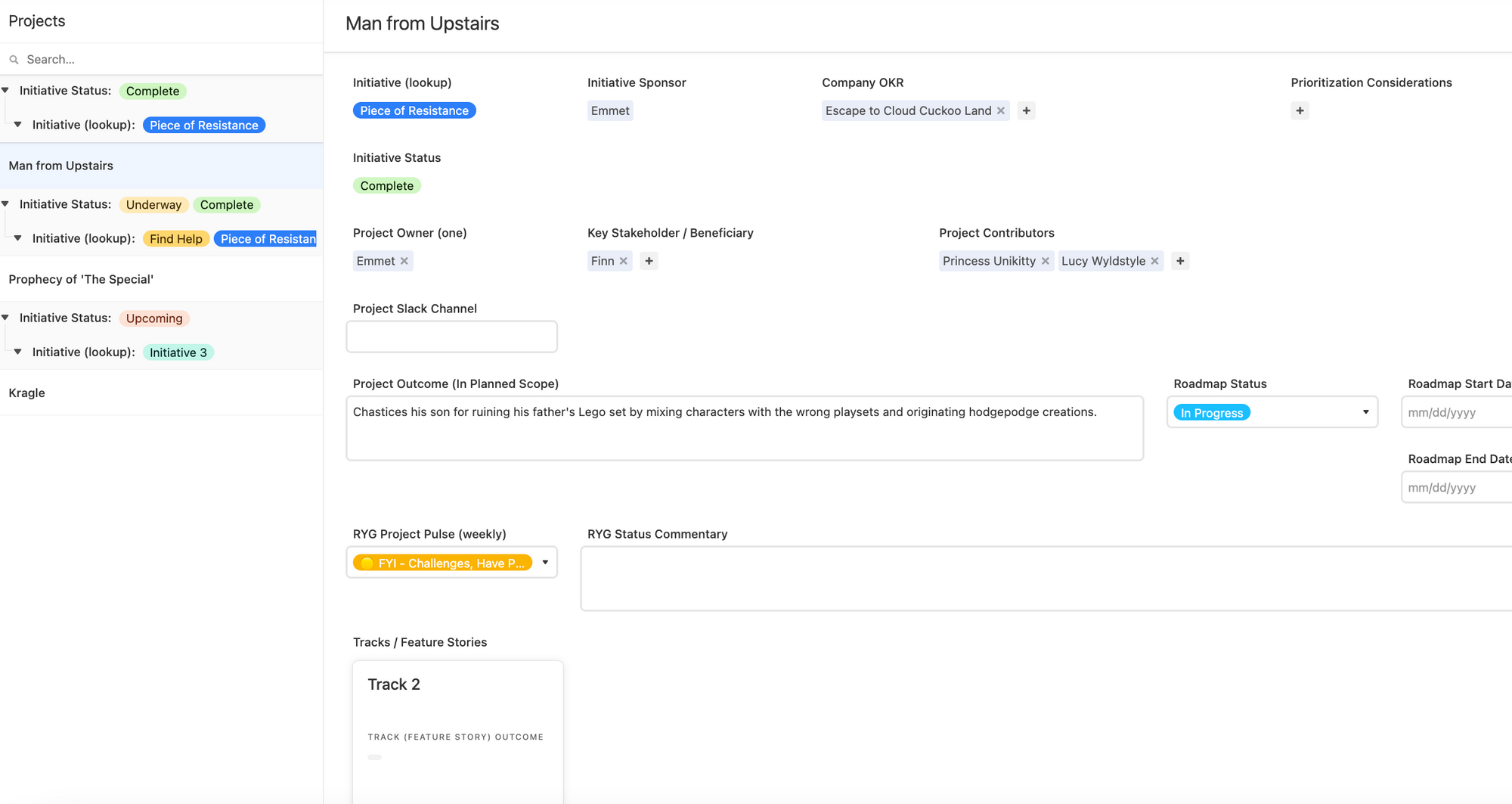
The Project Cards interface is where the magic happens, says Bodenlos. Essentially, this granular view lets you see all assumptions being made about any project, along with its outcomes.
Do team members have differing viewpoints about how a project should run, or its measures of success? Adding details into the Project Cards makes it easier for project leads to spot conflicts.
Project Cards, built to be viewed by status or by stakeholder, show how a project connects to higher-level efforts inside the organization. Bodenlos added an element in the interface (“Roadmap Status”) that shows the project’s connection to a larger company roadmap. Is an experiment totally failing? Why? And what can they do to help or unblock? This view lets managers know how a project ties into company goals.
“Traditionally, this type of information about why something worked or didn’t existed only in isolation in local files on people’s desktops or in their heads,” Bodenlos says. “Incorporating all the info into one system and connecting it is key.”
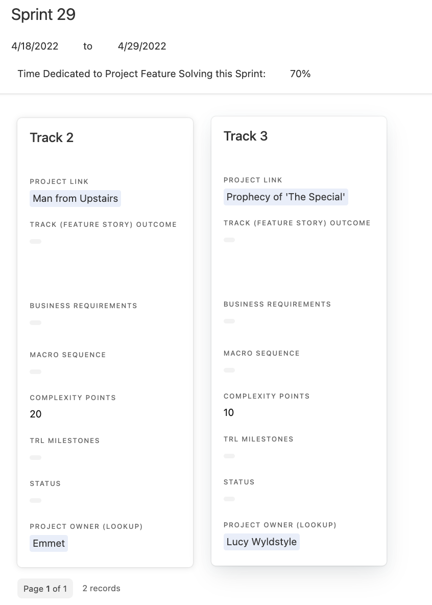
Interface 3: Sprint Staging
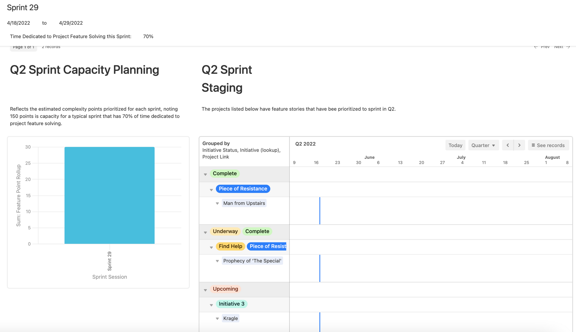
The sprint staging interface lets product managers see how their development team’s work fits into an all-important product roadmap. Basically, they can see how parts of their product are being built or developed over time. As teams carve off and create new features, managers use this view (which can be grouped by status, track, or team function) to identify blockers, see who is overloaded, and who should be reassigned to other tasks.
“This view lets you drill down to a person, see what they’re working on, and decide if they should work on something else,” Bodenlos says.
For example, some percentage of a development team’s time might need to be reserved for fixing bugs or dealing with on-the-spot issues.
The “capacity planning” formula here tells managers how much more (or less) a team can handle before they get swamped.
The color-coding, which can be customized however your team or company uses color, gives an immediate sense for who’s involved and what needs to be done.
“The visual cues really help catch people’s eyes,” she says. “I use tons of color-coding, to tell a story about progress, status, or functions within a company.”
With interfaces like those above, everyone from project leads to individual team members get an immediate sense for how their work fits into the big picture. Working out the details? It still requires plenty of daily effort. But better awareness of high-level goals can smooth the path between strategy and execution.
Ready to build your own interface in Airtable? Get started here.