Welcome to Interface Elementals, a series covering the unique types of elements that can bring your interface to life, your way—whether you’re designing for team members or executives. Interface Designer offers a variety of dynamic elements; here, we break them down and give you tips on when to use each.
Getting team members to take action can be tricky when they have to navigate an expansive base. With Airtable's Interface Designer, you can share digestible, relevant information in one clean interface so your people have what they need off the bat—no need to hunt around.
And behind every interface are “elements” that organize and display your data however you’d like. Here, we dive into two key design elements you can use to create context-rich interfaces for your team: the text and divider elements.
Provide context with the text element

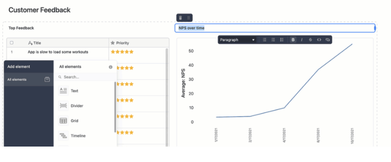
The text element is a simple text box you can drag and drop anywhere in your interface. You can write as much as you’d like in the box, though we suggest keeping it short and sweet to make the rest of the interface easy to navigate. The element’s drop-down menu lets you choose from a variety of text options—from different-sized headers to bulleted lists to code blocks. You can also include links!
When should I use the text element in Interface Designer?
We recommend using this element whenever you create an interface for someone else—whether it’s a collaborator or an executive—so they know how to interact with the information they’ve received.
For example, putting a title before a section of data (like a chart) is an easy way to help individuals contextualize the information they’re scrolling through. Another way you can use the text element is to provide a call to action (CTA) before an editable element so people know they have to take action (like approving an asset).
Break up data with the divider element

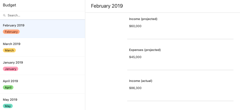
The more organized an interface is, the easier it is to understand its contents. The divider element, a simple long line, creates distinctions between groups of data so you don’t confuse anyone. It’s also easy on the eyes. 😉
⚡ Pro tip: Are you finding that your interface is still data-heavy, even with dividers? It’s possible you have enough information to fill several interfaces. Remember: you can create multiple interfaces that live on top of the same base!
When should I use the divider element in Interface Designer?
The divider element is ideal for any interface that utilizes multiple elements and/or contains different kinds of information. If you have four action items for your team in an interface, consider adding dividers to form four sections. Delivering a product launch progress report to leadership? Use the divider element to differentiate between each team’s list of updates.
Let’s incorporate these design elements now—click here to learn how to create your own custom interface, right from your base.