Introducing iOS grid view
No more are the days when only a few fields would show up in the cards on iOS. Although the cards were easy to read and tap on small screens, having to expand a record to see the rest of your fields meant an extra step to access your information — and it was difficult to compare fields across multiple records at once.
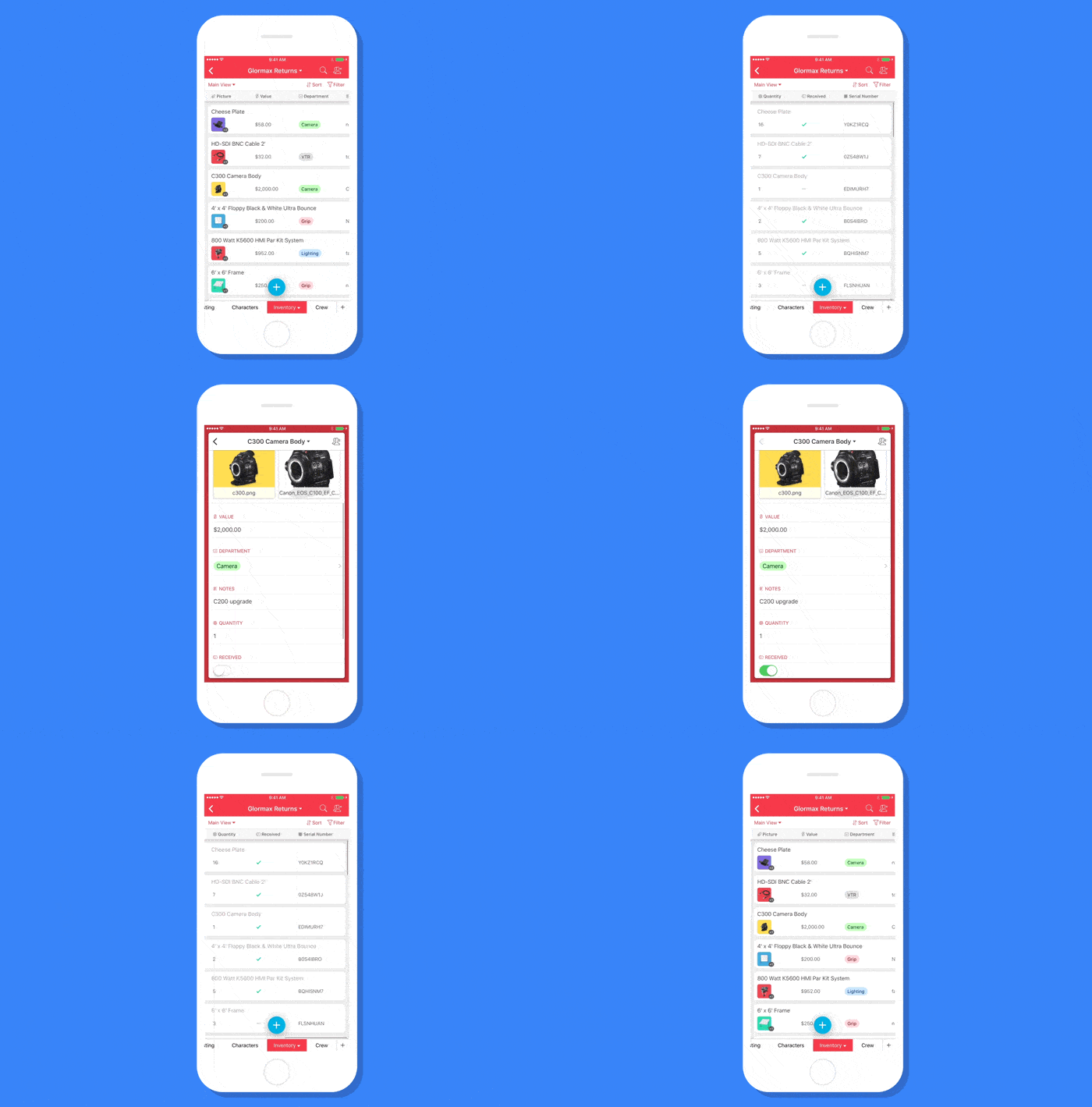
We didn’t want to lose some of the great aspects of our card design, though, and porting the grid directly from the web didn’t seem like the best experience. So we landed on a “scrollable card” design that combines the best parts of our tap-friendly cards with the flexibility to arrange and scroll through your fields at will:

With scrollable cards, you can scroll to the right on any record to see the remaining fields:

So this summary walks into a bar…
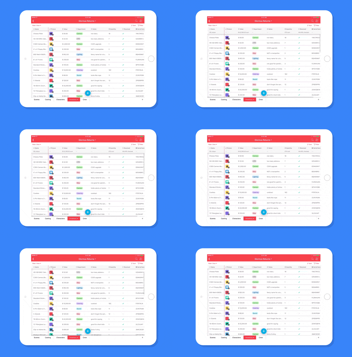
A favorite feature for many of our users on web is the summary bar. Today, it’s coming to iOS for the first time!
To access all your favorite summary functions, simply pull down on the header at the top of the screen:

Configure me this
Speaking of the header, you can save a little time by tapping on any field in the header to bring up the configuration screen. You can also drag your fields to change their order:

There you have it! Go get the update now.
Have feedback or suggestions for future updates? Drop us a line at team@airtable.com.